
2024

6 Week Classroom Project
KALEIDA/
ADVANCED PRINT DESIGN
The Brief
Developing a Print Collection for Home, inspired by the state of Andhra Pradesh, where our campus is situated.
It focused on understanding various traditional and non-traditional printing techniques, the nuances of block printing and the art of handling multi-color applications.
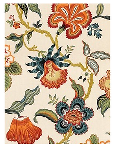
“Kaleida” is a celebration of the past and present, a reimagining of the traditional chintz textile that brings a new dimension to its floral legacy.

Concept Note
The visual language of Masalipatnam Chintz, a rich textile tradition, shows the intricate relationship held between its floral and fauna elements. These textiles from Andhra Pradesh are distinctly known for their floral patterns, which include lotus, jasmine, and other native plants, often combined with animal motifs like birds and elephants.
At the same time, many other natural elements are illustrative of this culturally and historically rich state.
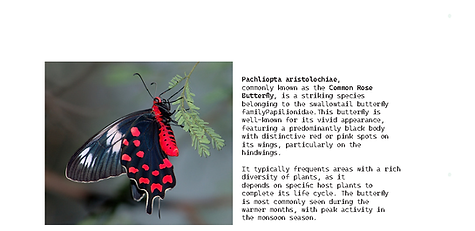
Surrounded in our campus by this flora, the flowering plants, sweeping fields and a consequent myriad of tiny creatures, this offers a novel approach to reimagine Chintz by incorporating insects, endemic to the state of Andhra Pradesh, jasmine flowers, the state flower of Andhra Pradesh, and hero these elements within the same traditional technique of block printing, that were traditionally often just used as secondary motifs.

Taking a more contemporary approach, a very bold colour palette was chosen, with predominantly
warm colours, a visual contrast from the reds, blues
and more muted colours of naturally dyed traditional
chintz.

Colour Palette

Client Profile
The imagined client space of this project is the living and dining space of an effluent home, with its residents upholding an appreciation for art, history and textiles. They may have traveled extensively, and their personal collection reflects influences from diverse cultures and art movements.
A client of this profile would enjoy the stories and origins behind the prints, from contemporary pieces to classical and vintage works, and bolder colourstories.
When it comes to traditional textiles, a crucial aspect to consider are the negotiables and non-negotiables of the textile.
In the case of traditional Chintz,
NON-NEGOTIABLES
Floral elements with supporting fauna, whether in a jaal or a composition
Heavily rendered, intricate and delicate motifs
Specific use of colours according to the dyeing process (traditionally)
Use of traditional printing techniques (traditionally)
NEGOTIABLES
Size and scale of the design
Fabric weight and feel
End use and application
Motifs and elements


About Chintz
Motif Development
The insects were first drawn realistically and then stylised in a chintz style with multiple variations, a combination of which was chosen as the final motif, all drawn on paper.


Once the final renders were selected, the motifs were hand painted and then digitally taken forward into various colour stories.


Final Motifs


3.5” * 5”

Colour separation for Blocks
Motif Development for the Wallpaper
Multiple jaal layout iterations were tried, using geometric and ornamental elements commonly found in traditional chintz designs. An ornamental ogee was finally selected and repeated to create the basic surface for the wallpaper.


The ogee was rendered into a bel by incorporating the jasmine flowers and its buds, with the dip in the design highlighted with the stems curving into the bel.


A small repeat of jasmine flowers was added after every two jaal repeats, to add some further detail and visual interest, suggestive of the way the flowers tend to fall on the ground naturally.
A visually pleasing placement for the insects was decided upon, with the six motifs repeating in
a half drop, brick repeat.


Final Reikh and Datta separation of the bel for the Jaal.
Screens for the final wallpaper


The Final Collection (living and dining room)


Coordinates and Block Separation


Colourways

Colourway 01
Since the main colour story is vibrant and warm,
cooler palette was chosen for the first colourway, with
hues of blue and pinks.
To keep the delicate look and feel of the flowers,
green has been used for the bel in all colour stories,
with a light colour for the jasmine flowers.
Winter Solstice


Colourway 02
The brand ‘Rangotri’ was taken as the inspiration for this colourway. A medium background was tried for the wallpaper, with a more subdued and spring-like colour palette.


Rose & Pine


Colourway 03
For the third colourway, the colour palette was chosen to create a very warm variation to the original colourstory.


Toasted Spice


