


VANIKA/
GRADUATION PROJECT I
2026
An exploration of botanical and floral forms reinterpreted for contemporary home furnishings, developed across various collections of drapery, upholstery, wallpaper, embroidery, and print.
Traditional floral vocabularies were contemporised through abstraction, altered scale, simplified forms, unconventional compositions, and textural interventions, creating surfaces suited to the modern domestic market.
Sponsored by VAYA Home, Universal Textile Mills


Overview of the Graduation project
Guided by a combination of studio briefs and independent design explorations, the developments for all three collections responded to various categories each requiring a distinct visual and technical approach.
It’s worth emphasising that these collections are mostly uncoordinated in nature. The fabrics within them are intended to stand as strong, individual
pieces that can seamlessly integrate into the brand’s curated collection. In essence, each fabric within these collections embodies a distinct concept and design process, ensuring a unique and singular character for each piece.

X

Brand Study & Visual Gallery
Given the broad and diverse nature of the home furnishing market, a curated selection of international brands was studied to understand varying approaches to design language, materiality, craft, colour, and market positioning.
Their collections were analysed to identify recurring visual cues, emerging directions, and opportunities relevant to VAYA.


Sargam - Jacquard Upholstery
The goal of this design was to reinterpret an existing fabric
reference from the export studio and adapt it so that it could
fit within a contemporary floral collection. (as seen above)
From the different possible directions, a modern reworking
of a chintz-inspired layout was chosen as the most
promising approach.

Design 01


A set of hand-drawn motifs, including birds, florals, foliage and fruit forms were drawn. The motifs were intentionally kept slightly asymmetrical and organic so that the surface would not feel overly formal or archival.
This irregularity helped preserve a sense of
contemporaneity and abstraction, allowing the design to be new rather than reading as a direct historical reproduction.
Chosen motifs were coloured with flat colours
since the design was to be woven on a
jacquard loom.
A modern and bright colour scheme was chosen,
independent of traditional chintz colours to break
monotony and add vibrance.


Once the motif set had been established, the design
was translated into repeat and explored through
multiple layout iterations.
The initial arrangement were found to be too
rigid, with the composition feeling overly controlled
and lacking the openness needed for the surface to
breathe. This was rectified by adding more white space and reducing the number of elements.

Final Design

The design is under production, to be woven on a end-on-end warp. Mockups are for representational purposes only, to aid to visualise the final output


Kaanan - Velvet Print
This brief was developed in response to VAYA’s
upcoming collection, which aimed to introduce digital
print on velvet as a new surface direction. The objective
was to create a design that felt traditionally rooted, rich,
and statement-making, while still being reinterpreted in a
way that aligned with a more contemporary furnishing
context.
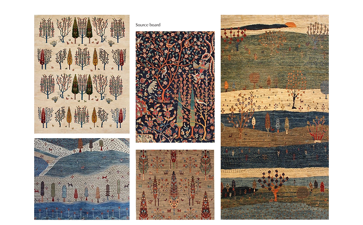
The visual language of Persian Gabbeh Rugs
was selected as an appropriate starting point,
offering a vocabulary of bold geometry, stylised motifs,
that had not been explored yet for the velvet print
collection.
Design 02


The design process began with a set of hand-drawn elements derived from the rug references, which were then developed into a repeat composition. The motifs were repeated or slightly manipulated to keep consistency within the design.
Forms were sized according to their placements and trees were drawn to fit within empty spaces. The intention was to create an all-over surface that retained the look of the woven carpets while adapting it into a format suitable for print.


To introduce greater movement and distinguish the
design even more, a background of rolling hills was
incorporated into the composition. This addition helped
create a stronger sense of depth and visual dynamism,
allowing the design to function as more of a statement
surface rather than a very even pattern.
Multiple colourways were then developed to
explore different interpretations of the design,
ranging in depth, contrast, and decorative
emphasis.
Final Design


Manjari - Embroidered wallpaper
The brief required reinterpretation of an existing sisal
wallpaper developed by the UTM Export Studio to adapt
it into a version suitable for VAYA’s collection.
The overall vertical format of the original design was to be
retained, along with certain defining elements of its visual
language especially the branching floral structure, the
presence of buds, and the inverted V-shaped stitch effect
that contributed to its character.
The process began with the exploration of different bud forms and branching structures, testing how the original vocabulary could be reinterpreted without losing its essential identity.

Design 03


Following production, however, certain practical challenges emerged. The design was being embroidered onto Sisal, the wallpaper base used for this category, which has a tendency to crinkle and wrinkle easily during handling.
Because the original design required a considerable amount of thread trimming, the design was revisited with the aim of reducing the amount of visible trimming while retaining the overall structure of the approved composition.


Final Design


Design 04
Gulnaar - Jacquard Upholstery
The brief for this upholstery fabric was to develop a design suited for jacquard that drew from a more traditional decorative language while still feeling appropriate for VAYA’s furnishing context.
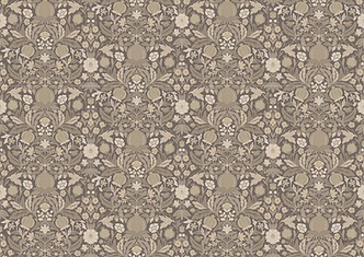
During the initial discussions, the direction of William Morris inspired botanical designs emerged as a promising starting point, offering a rich visual vocabulary of foliage, stylised fruits, and layered ornamentation.
Alongside this, there was a particular interest in exploring the pomegranate as a motif, which became one of the central elements around which the design began to take shape.


Several symmetrical compositions were explored to create a dense yet balanced upholstery repeat, with foliage, florals, and fruits drawn directly within the layout to maintain the figure-ground relationship.
Bird motifs included in the initial iterations were later replaced with botanical and fruit elements, making the design more universally relevant while retaining its decorative, archival character.


Final Design
The initial scale felt too large and heavy for upholstery, so the repeat was reduced to run four times across the fabric width, creating a more balanced surface.
A straight repeat was then reworked into a half-drop to reduce predictability and create a more natural flow. Further refinements focused on softening select motifs and balancing colour distribution to avoid visual clumping in the woven fabric.




Direction II
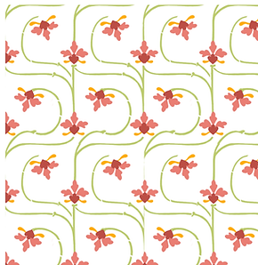
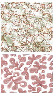
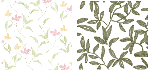
Unlike the earlier developments, which were focused on a single visual source, this stage was driven by the broader question of how florals, foliage, buds, and botanical elements could be reinterpreted in a way that felt relevant to a modern aesthetic.
The intention was not to reproduce conventional floral furnishing
patterns, but to search for directions that felt newer in composition,
treatment, and surface language while still remaining commercially
viable and technically translatable.






Design 05
Taala - Jacquard Upholstery
This concept looked at florals through a geometric lens, using tessellation to build a repeat suitable for contemporary upholstery. The aim was to retain the softness of a floral while giving the design a clearer, more structured character.
Several motif variations were explored before arriving at the final form. The design was refined to find a balance where the floral quality remained visible without overpowering the tessellated structure.


This was then further manipulated, to add more visual
interest by adding lines and dots that made the design
even more graphic for upholstery.
Final Design

Design 06
Bahaar- Jacquard Upholstery
Among the options explored, the organic quality of
certain floral forms stood out, particularly when
combined with the idea of filling the forms with an
internal texture or contrasting colour rather than treating
them as flat motifs.
The first design emerged from this set of floral concepts,
wherein the most promising aspects of multiple ideas
were brought together into a single direction.


The organic floral forms were retained, while the interior
of the motifs was developed through a secondary texture
layer, allowing the design to feel richer and more
contemporary than a straightforward floral repeat.
At the same time, the composition was made more
complex by introducing an additional background layer
that suggested foliage without reading too literally as
leaves.
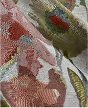
Weave and look references were chosen which complement
the forms and provide opportunities for colour variation. The
design was reduced into 5 colours for production efficiency.
The design is awaiting production.

Final Design


Additional designs developed from the same jacquard upholstery brief, explored in greater detail in the main document.
Design 06
Boganvel - Embroidered sheer
One of the more modern Bougainvillea-inspired concepts
developed during the exploration phase was appreciated and selected for further development.
A series of more organic variations were explored, eventually leading to a hand-drawn floral treatment developed in coloured pencil. This version introduced a softer, more tactile quality to the design while preserving the modernity of the original concept.


The first trial was sampled on a pre-existing black-and-white printed sheer, but the composition felt too reliant on the floral forms. To introduce greater variation, simplified bougainvillea leaves were studied and developed using the same coloured-pencil treatment.
The leaves were integrated into the composition using the same embroidery technique, and the revised design was then sampled on a plain sheer base for a cleaner, more balanced surface.

Final Design

